Executive Planning
[/ultimate_heading]
The Center of Race and Gender at the University of California sought to create a platform for graduate students, professors, and public figures to collaborate internationally with policymakers on matters of the social and political climate, and the status quo globally.
Team
[/ultimate_heading]
The workshop consisted of the departmental professors, the board of advisors, and the center’s director.
Product Design
[/ultimate_heading]
The result of the workshop articulated the need to conduct UX Research in order to analyze and identify platform usability that would conform to the main-use cases.
The main use cases include graduate students, professors, and public figures that seek to share publish their work departmentally within the university’s internal and external networks. Furthermore, to collaborate with other universities domestically and internationally on identified studies, and to house and host all fragments of research projects.
The platform would feature an intelligent registration process, multiple databases, user roles, user profiles, portfolios, messaging, bulk messaging, in-house email solution, calendar and availability system, user dashboards, and social media integrations. The platform will also feature frontend and backend gateways to securely collaborate and then share publications with the public.
The finished product would centralize domestic and international collaboration on research projects as well as independent works. The platform will also allow users to publish to the public via university accreditation.
Primary Goal
[/ultimate_heading]
Although we will be conducting additional user research throughout our initial design and development process, we knew it was critical to start with defining the platform’s core fundamentals. While goals and needs may remain stable, user expectations are evolving day by day. We designated this process as phase one of the UX Research initiatives:
- To gain insight into the design and development of an innovative collaborative platform that focuses on three main user roles: publishers, researchers, and policymakers.
- To understand the best use cases in the design and development.
- To validate and understand the platform’s target market, users, and their needs.
Additional Goals
[/ultimate_heading]
We also wanted to gather initial impressions of CRG’s IRDP at UC Berkeley before it launches. We felt it necessary to create additional goals:
- To confirm and enhance our understanding of various user research practices.
- To gather first impression feedback on the new platform’s UI/UX.
- To inform and prioritize items for our new design sprint.
To achieve these goals, we decided to use a mixed approach of Quantitative and Qualitative research methods. The quantitative research would reveal what areas we need to focus on, and the qualitative research would help us understand the context and the “why” behind the answers.
Quantitative Research: “What” do we need to focus on? (Phase One)
[/ultimate_heading]
For our quantitative research phase, we decided to create and use survey questionnaires. Surveys are easy to put together and provided quick statistics from a diverse sample of our main user roles to lead the initiatives.
The first questionnaire initiated focused on the user-experiences with the following similar platforms at the following Universities:
- Stanford
- UCLA
- Harvard
The second questionnaire initiated focused on defining the main use cases of the platform.
The third questionnaire initiated focused on provided us with insight on usability and features sought by users in the cross-platform concept.
Dividing the study into segments ensured the quality of the data collected as each questionnaire’s average duration was five to ten minutes maximum.
Findings: Survey One
[/ultimate_heading]
Publishers
[/ultimate_heading]
Researchers
[/ultimate_heading]
Policymakers
[/ultimate_heading]
The findings indicate a fluctuation in user-experiences and preferences across the main user roles. Publishers, researchers, and policymakers prefer platforms relative to unique use-cases. All universities offered use-cases relative to all three main user roles, others prefered more than others. While we already knew this, it was great to see the data confirm that these are platforms each user role prefer.
Findings: Survey Two
[/ultimate_heading]
Publishers
[/ultimate_heading]
- Publish
- Directory
- Access
- Collab
- DB
Researchers
[/ultimate_heading]
- Publish
- Directory
- Access
- Collab
- DB
Policymakers
[/ultimate_heading]
- Publish
- Directory
- Access
- Collab
- DB
The findings indicate a fluctuation between the main use-cases across user-roles. In other words, what can we do stabilize use-cases for this platform? What are their user experiences and what is the relevance of importance? This survey helps us answer those questions.
Findings: Survey Three
[/ultimate_heading]
Platform Features: Employers, Talent & Recruiters
[/ultimate_heading]
- Publishers
- Researchers
- Policymakers
This findings of this survey are crucial for development. The findings illustrate what features users need on a platform relative to the recruiting industry. We found that publishers and researchers could be considered sister user roles, where the fluctuation in feature requests are minimal compared to the counterpart user role of policymakers. The dual-shaded areas between publishers and researchers illustrate a primary set of targeted features, where single usage features are still of relative importance, however since we are targeting three different kinds of users, we need to make sure that we adhere to usability parameters defined. Tri-shaded areas are areas of extreme relevance and thus float to the top of production immediacy.
Qualitative Research: “The Why?” (Phase Two)
[/ultimate_heading]
For our qualitative research phase, we decided to utilize focus groups and discussions as our prime source for data. Focus groups are easy to facilitate and they provided us with real-world applications to collect data and results.
Our focus groups consisted of five different groups:
- Professors (publishers and researchers)
- Graduate Students (publishers and researchers)
- Public Figures (publishers and researchers)
- Policymakers
- Collective (publishers, researchers, and policymakers)
With each of the groups, we took our initial findings from the first phase of our research to learn more about the context behind the results. The focus groups were fun, we rewarded our participants and we were able to illustrate the reasoning behind our items of focus.
After the focus groups, we also conducted one-on-one interviews with randomly selected participants to gain further insight and context behind usability trends.
Domestic & International Remote Usability Studies
[/ultimate_heading]
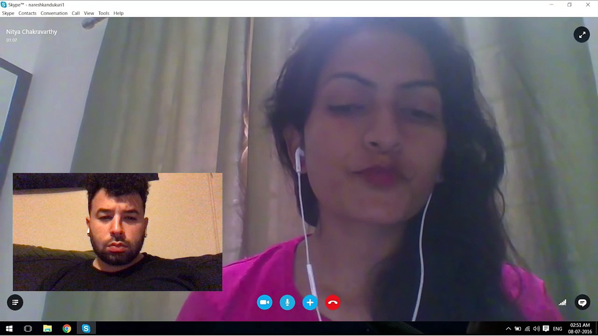
Another aspect of this project was to conduct remote and in-person usability studies across the spectrum of various user-roles. Since the platform seeks to allow users to collaborate internationally, respectably the usability studies must encompass the user-roles geographically.
We conducted in-person usability studies in France and Turkey. We were able to unlock the different dimensions in the main use-cases via regional norms. The language barriers and political processes presented a significant alarm in regards to usability and conforming with regional political climates.
As we dove further into remote usability studies, we were to garner a broader reach in data from various countries and universities. The most significant takeaway from these studies is the special set of circumstances we would have to incorporate into the platform per international university relationship.
Conclusion
[/ultimate_heading]
The results of our findings were very pleasing and rewarding in terms of development. The findings allowed us to transform the beta version of the platform into a very promising release for across user-roles. It helped us define a coordinated approach for usability between user-roles and main use-cases. This transitioned into a proportionate development schedule with meaningful milestones to atone for our development.
Summary
[/ultimate_heading]
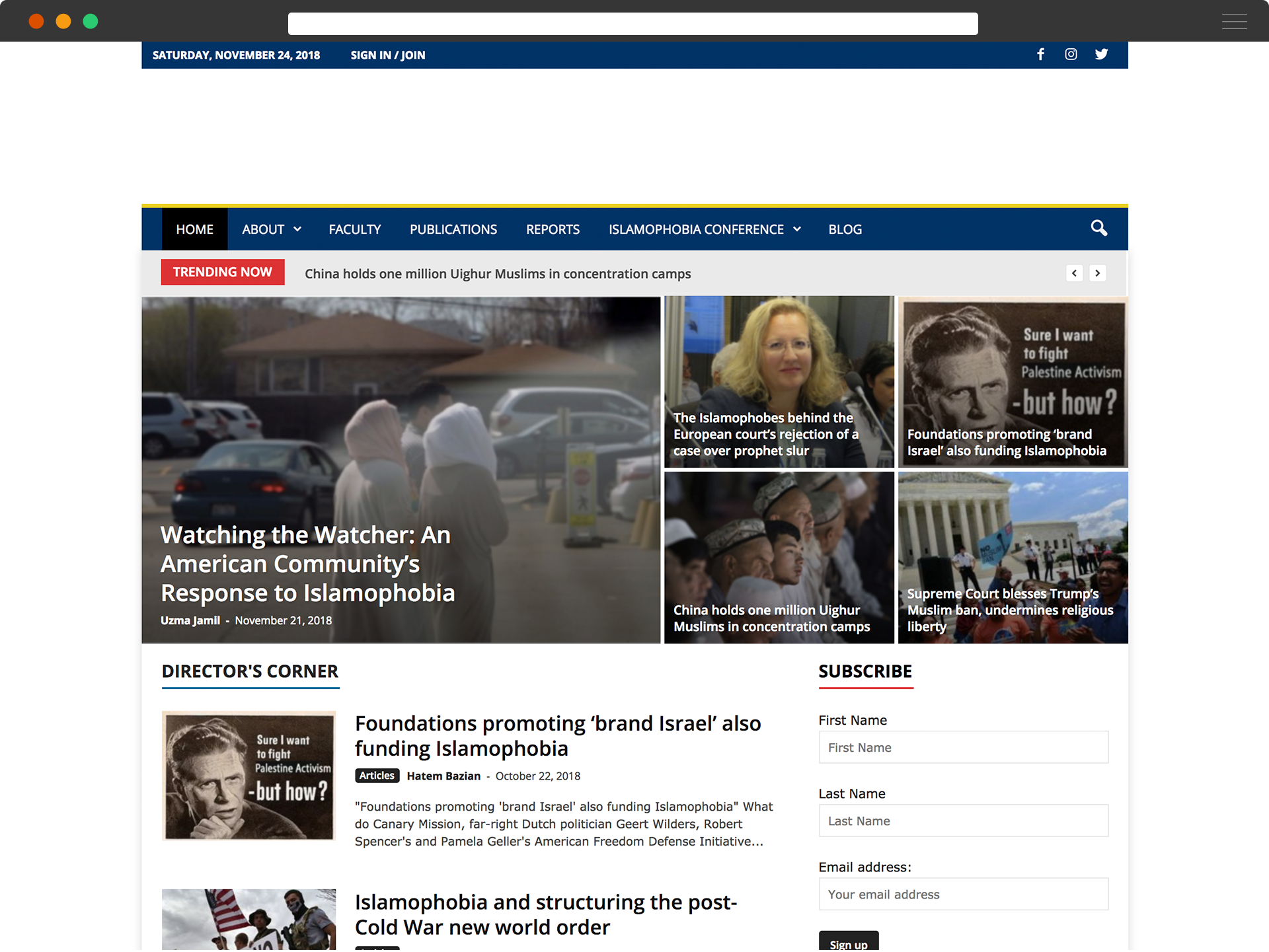
The UI/UX architecture and design of IRDP came with a great deal of planning to ensure that as a new product it appeals to IRDP’s targeted tribes’ main use-cases. Below is a sample of one of the procedural iterations before crafting a final UI/UX.
User-Centered Design
[/ultimate_heading]
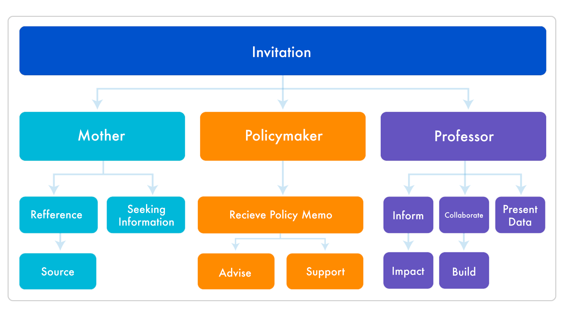
The strategy behind the usability of this platform is the user-centered design focus. The map below helps organize the main use-cases for all the user-roles associated with the platform. Indirectly, it also serves as a site-map, condoning use-cases and limiting others.
User Stories
[/ultimate_heading]
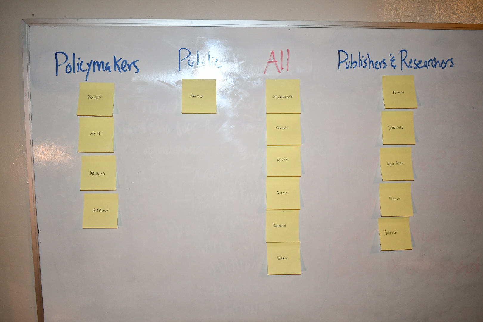
The user stories are an important part of development. This example meets the criteria of Bill Wake’s INVEST acronym. This user story is about all of the role who interact with the system or who realize some value or benefit from the system. Our big three are public, policymakers, and the sister-roles: publisher and engineers.
Wireframe
[/ultimate_heading]
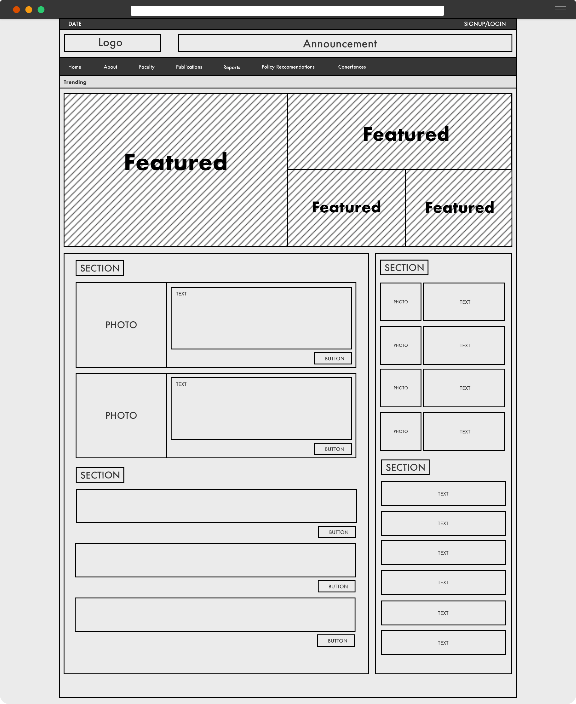
After research and analysis, my design process always starts with a wireframe. Wireframes help you position, define features, propose usability challenges, and make it easy for transitioning into a mockup design. The example below is the low-fidelity rendering of what the public will see on the front page and how publications will essentially be displayed. We went through this process more heavily for the backend, it required multiple iterations, in comparison with the front end.
Dashboard
[/ultimate_heading]
This is a mockup example of the frontend and what it looked like after we took the wireframe design to the next phase. The UI is simple and illustrates a look and feel of a research/publication website. We want users to be able to access all material available, the faculty directory and source/reference the work of the contributors. This is an early iteration following evaluations and revisions, rendering the final product.
 Previous Project
 Next Project
ABOUT THIS PROJECT
IRDP is a project under the Center for Race and Gender at the University of California, Berkeley. This project included an evolving variation of UX Research and Design. It was our goal to create a place for contributing faculty present research and finding in order to impact policy, as well as collaborate internationally.
- Client:
- Categories:
- Skills:
- Project Url:
- Share Project :
 Previous Project
 Next Project