Executive Planning
[/ultimate_heading]
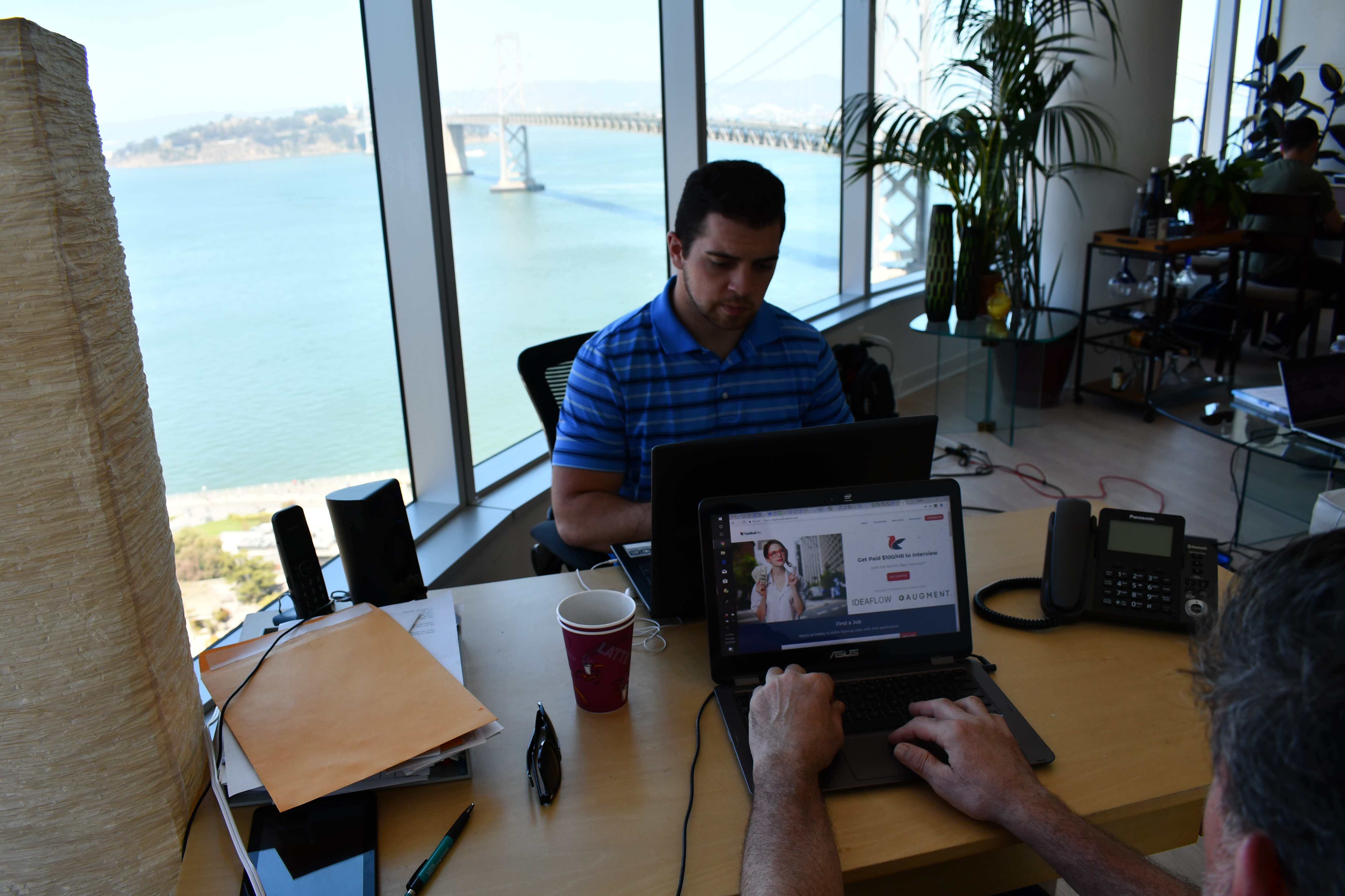
Building a company from the ground up is not an easy task. Taking a vision and materializing it into a tangible form can be even more challenging. Our first mission for CardinalHire was to sit down with the executive team and stakeholders to contextualize our goals and the methods by which we will reach them.
Team
[/ultimate_heading]
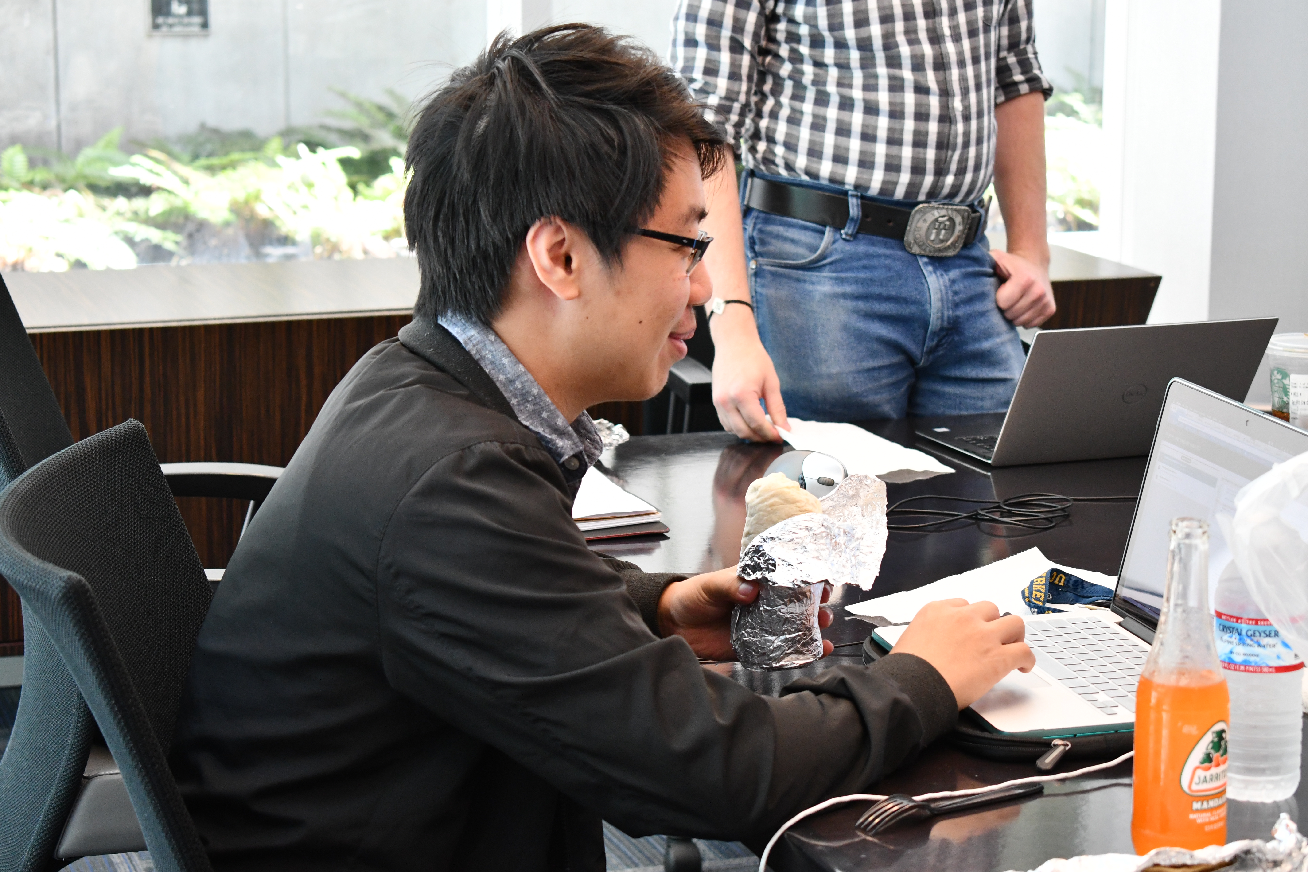
The workshop consisted of the founder and CEO, who is a Cal and Stanford MBA alumni, the head engineer, also a Cal alumnus, co-head engineer, a machine learning engineer at Google, and the platform’s consultant, the former Director of Engineering at Linkedin.
Product Design
[/ultimate_heading]
The result of the workshop articulated the design of a top talent marketplace that catered to employers, full-time talent, freelance talent, external recruiters, internal recruiters, and internal account managers.
The main use cases include employers who are looking to hire top talent, whether full-time or freelance, top-tier talent seeking full-time employment or contract work, external recruiters seeking to access the database for their independent clients, and internal recruiters and account managers to help navigate and motivate opportunities.
The product would feature an intelligent registration process, multiple databases, user roles, user profiles and portfolios, messaging, bulk messaging, in-house email solution, calendar and availability system, user dashboards, payment gateway, and social media integrations.
The finished product would be a combination of hiring platforms like Hired and a career network like LinkedIn Recruiter. The competition would then be any company that falls along those lines. To challenge such competition, we looked UX Research to provide some insight.
Product Management
[/ultimate_heading]
Primary Goal
[/ultimate_heading]
Although we will be conducting additional user research throughout our initial design and development process, we knew it was critical to start with defining the platform’s core fundamentals. While goals and needs may remain stable, user expectations are evolving day by day. We designated this process as phase one of the UX Research initiatives:
- To gain insight into the design and development of an innovative hiring platform that focuses on three main user roles: employers, talent, and recruiters.
- To understand the best use cases in the design and development of a cross-platform concept fusion of LinkedIn Recruiter and Hired.
- To validate and understand the platform’s target market, users, and their needs.
Additional Goals
[/ultimate_heading]
We also wanted to gather initial impressions of CardinalHire since before it launches into the marketplace. We felt it necessary to create additional goals:
- To confirm and enhance our understanding of various user research practices.
- To gather first impression feedback on the new platform’s UI/UX.
- To inform and prioritize items for our new design sprint.
To achieve these goals, we decided to use a mixed approach of Quantitative and Qualitative research methods. The quantitative research would reveal what areas we need to focus on, and the qualitative research would help us understand the context and the “why” behind the answers.
Quantitative Research: “What” do we need to focus on? (Phase One)
[/ultimate_heading]
For our quantitative research phase, we decided to create and use survey questionnaires. Surveys are easy to put together and provided quick statistics from a diverse sample of our main user roles to lead the initiatives.
The first questionnaire initiated focused on the user-experiences with the following platforms:
- LinkedIn Recruiter
- Hired
- Angel List
- CardinalHire
The second questionnaire initiated focused on defining the main use cases of the platform.
The third questionnaire initiated focused on provided us with insight on usability and features sought by users in the cross-platform concept.
Dividing the study into segments ensured the quality of the data collected as each questionnaire’s average duration was five to ten minutes maximum. To ensure all participating All participating members of this study were given incentives to carry out the study to end, in which employers were awarded free access to the platform for a defined duration, and talent and recruiters were rewarded with gift cards and other prizes.
Findings: Survey One
[/ultimate_heading]
Employers
[/ultimate_heading]
Talent
[/ultimate_heading]
Recruiters
[/ultimate_heading]
The findings indicate a fluctuation in user-experiences and preferences across the main user roles. As expected, employers, talent, and recruiters prefer platforms relative to unique use-cases. Angel List and Zip Recruiters offered use-cases relative to all three main user roles. While we already knew this, it was great to see the data confirm that these are platforms each user role prefer. It was also great to see how CardinalHire fares against its primary competition.
Findings: Survey Two
[/ultimate_heading]
Employers
[/ultimate_heading]
- Search
- ATS
- Profiles
- Messaging
- Analytics
Talent
[/ultimate_heading]
- Search
- ATS
- Profiles
- Messaging
- Analytics
Recruiters
[/ultimate_heading]
- Search
- ATS
- Profiles
- Messaging
- Analytics
The findings indicate a fluctuation the main use-cases across user-roles. In other words, what is the incentive for each user-role to use the CardinalHire platform? What are their main use-cases and what is the relevance of importance? This survey helps us answer those questions.
Findings: Survey Three
[/ultimate_heading]
Platform Features: Employers, Talent & Recruiters
[/ultimate_heading]
- Employers
- Talent
- Recruiters
This findings of this survey are crucial for development. The findings illustrate what features users need on a platform relative to the recruiting industry. We found that employers and recruiters could be considered sister user roles, where the fluctuation in feature requests are minimal compared to the counterpart user role of talent. The dual-shaded areas between employers and recruiters illustrate a primary set of targeted features, where single usage features are still of relative importance, however since we are targeting three different kinds of users, we need to make sure that we adhere to usability parameters defined. Tri-shaded areas are areas of extreme relevance and thus float to the top of production immediacy.
Qualitative Research: “The Why?” (Phase Two)
[/ultimate_heading]
For our qualitative research phase, we decided to utilize focus groups and discussions as our prime source for data. Focus groups are easy to facilitate and they provided us with real-world applications to collect data and results.
Our focus groups consisted of five different groups:
- Employers (Startups & Tech Companies)
- Talent (Seeking Full Time Employment)
- Talent (Seeking Contract/Freelance Work)
- Recruiters (Technical and Non-Technical)
- Collective (Employers, Talent & Recruiters)
With each of the groups, we took our initial findings from the first phase of our research to learn more about the context behind the results. The focus groups were fun, we rewarded our participants and we were able to illustrate the reasoning behind our items of focus.
After the focus groups, we also conducted one-on-one interviews with randomly selected participants to gain further insight and context behind usability trends.
Conclusion
[/ultimate_heading]
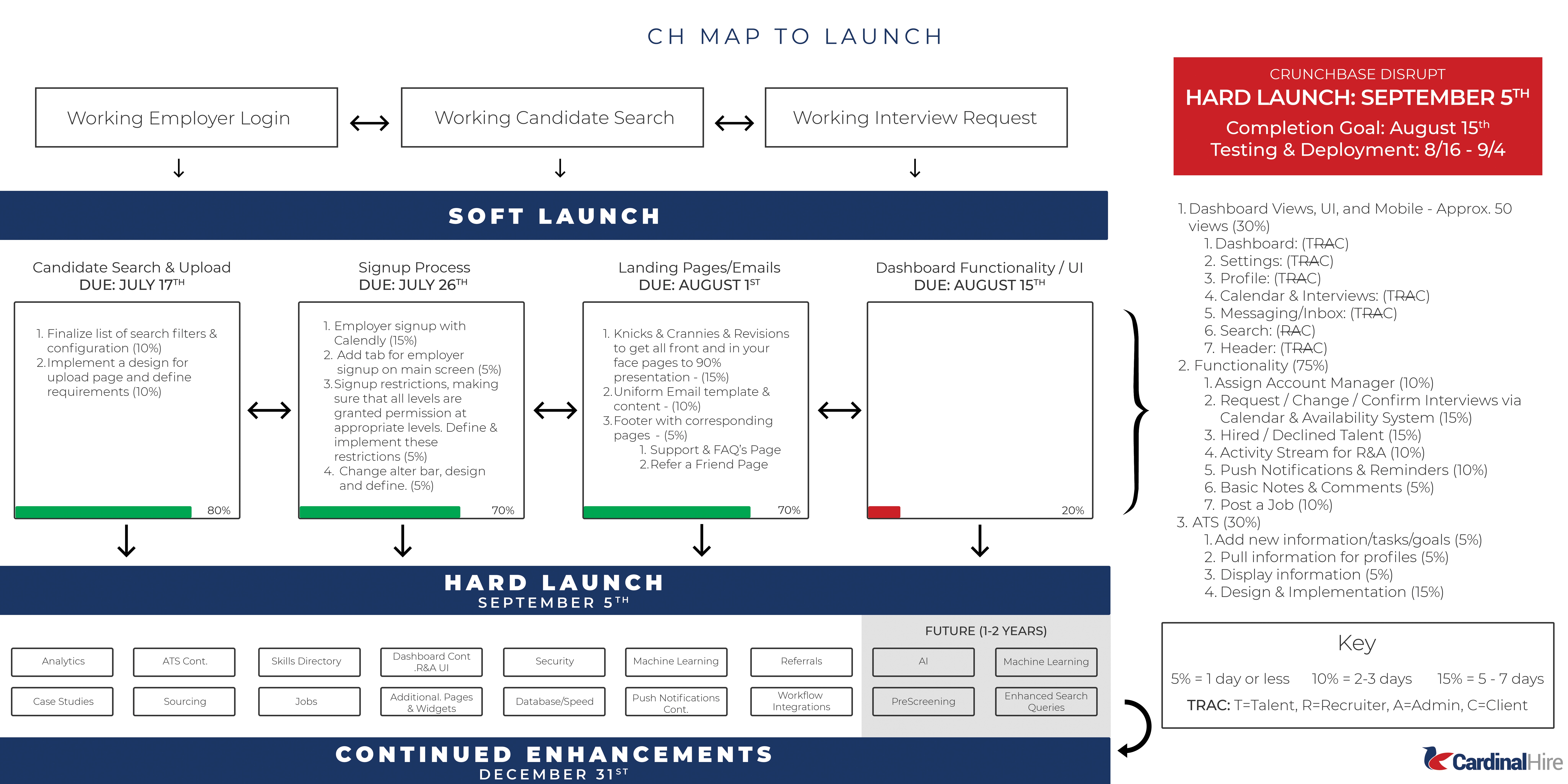
The results of our findings were very pleasing and rewarding in terms of development. The findings allowed us to transform the beta version of the platform into a very promising release for across user-roles. It helped us define a coordinated approach for usability between user-roles and main use-cases. This transitioned into a proportionate development schedule with meaningful milestones to atone for our development.
Summary
[/ultimate_heading]
The UI/UX architecture and design of CardinalHire came with a great deal of planning to ensure that as a new product it appeals to CardinalHire’s targeted tribes. The holistic architecture and design involved a total of 62 screens and 47 UI elements. Below is a sample of one of the earlier iterations before crafting a final UI/UX.
Landing Page
[/ultimate_heading]
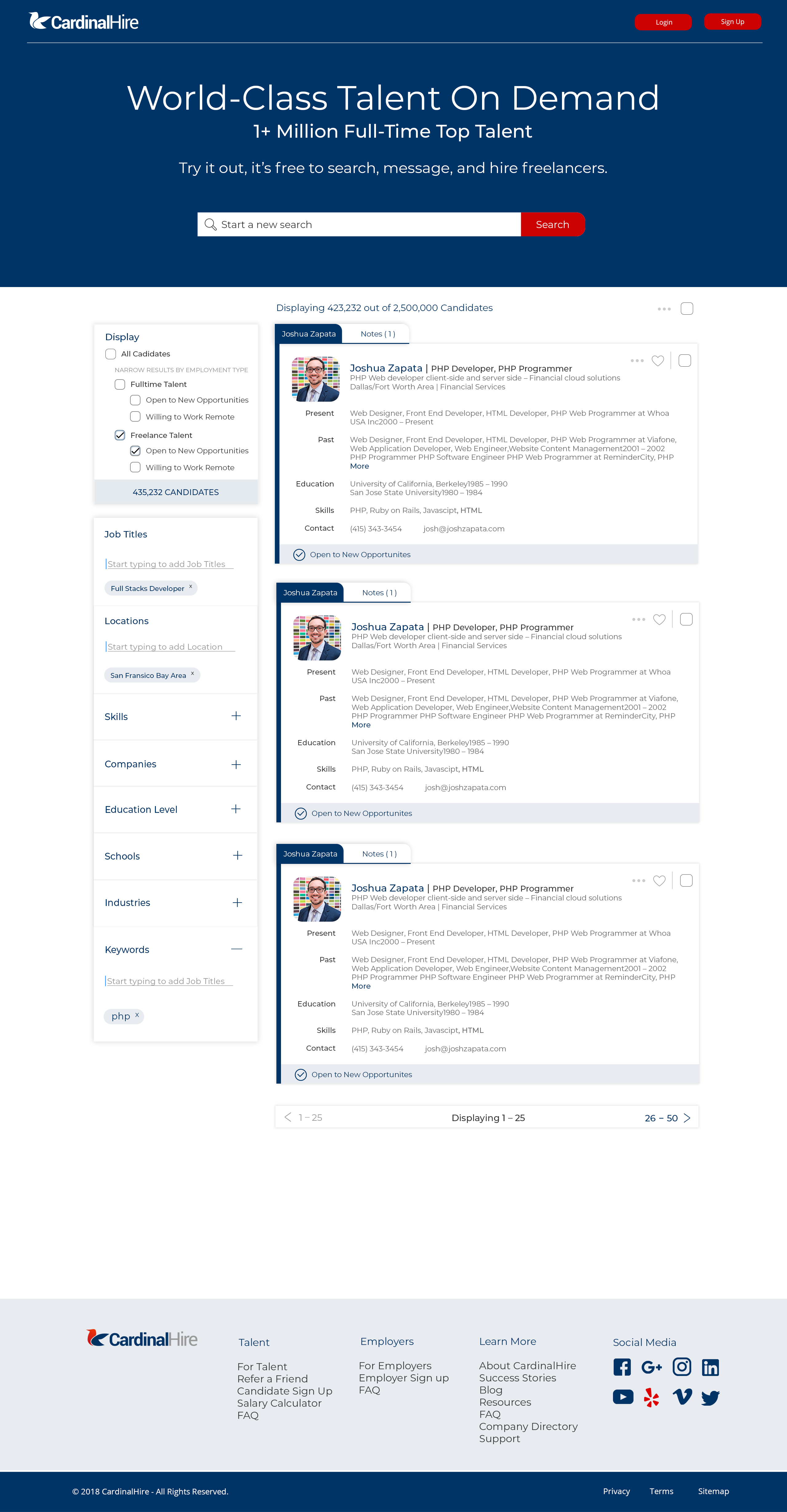
The strategy behind the landing page is significant in the sense that we wanted employers, talent and recruiters to see the product live in action before making any commitments. This form of transparency allows employers to experience the product’s deliverables as it will appear to them, allow talent to see how they will be viewable to employers and allow recruiters to witness the power of the CardinalHire search with a small snapshot of its database.
Login & Sign Up
[/ultimate_heading]
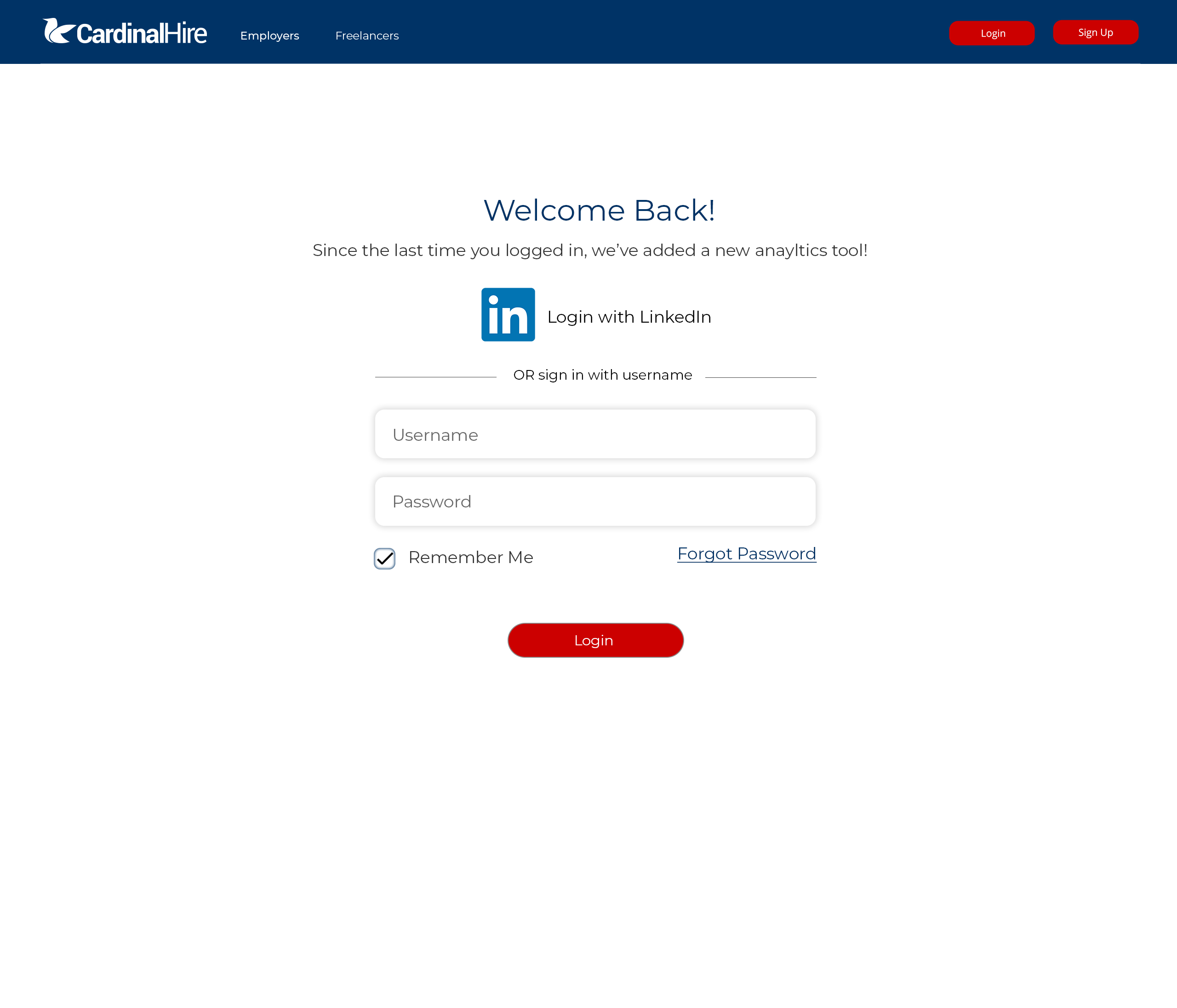
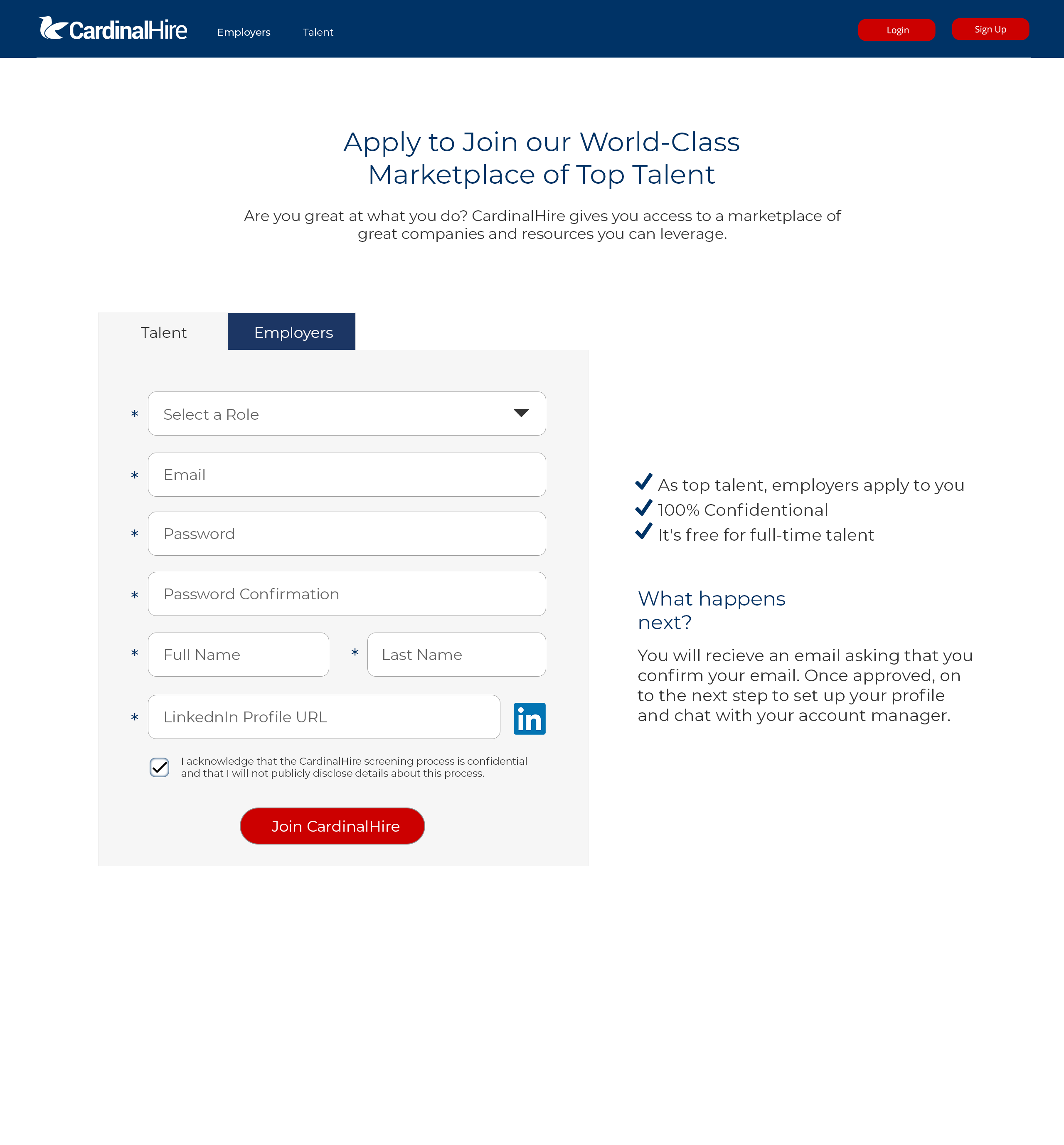
The login and sign up pages are very simple and minimalistic. Applied into the designs is an integration with LinkedIn. For sign up, the tabbed form allows CardinalHire to have one global sign up page that routes to the appropriate registration process based on defined user-role.
Registration
[/ultimate_heading]
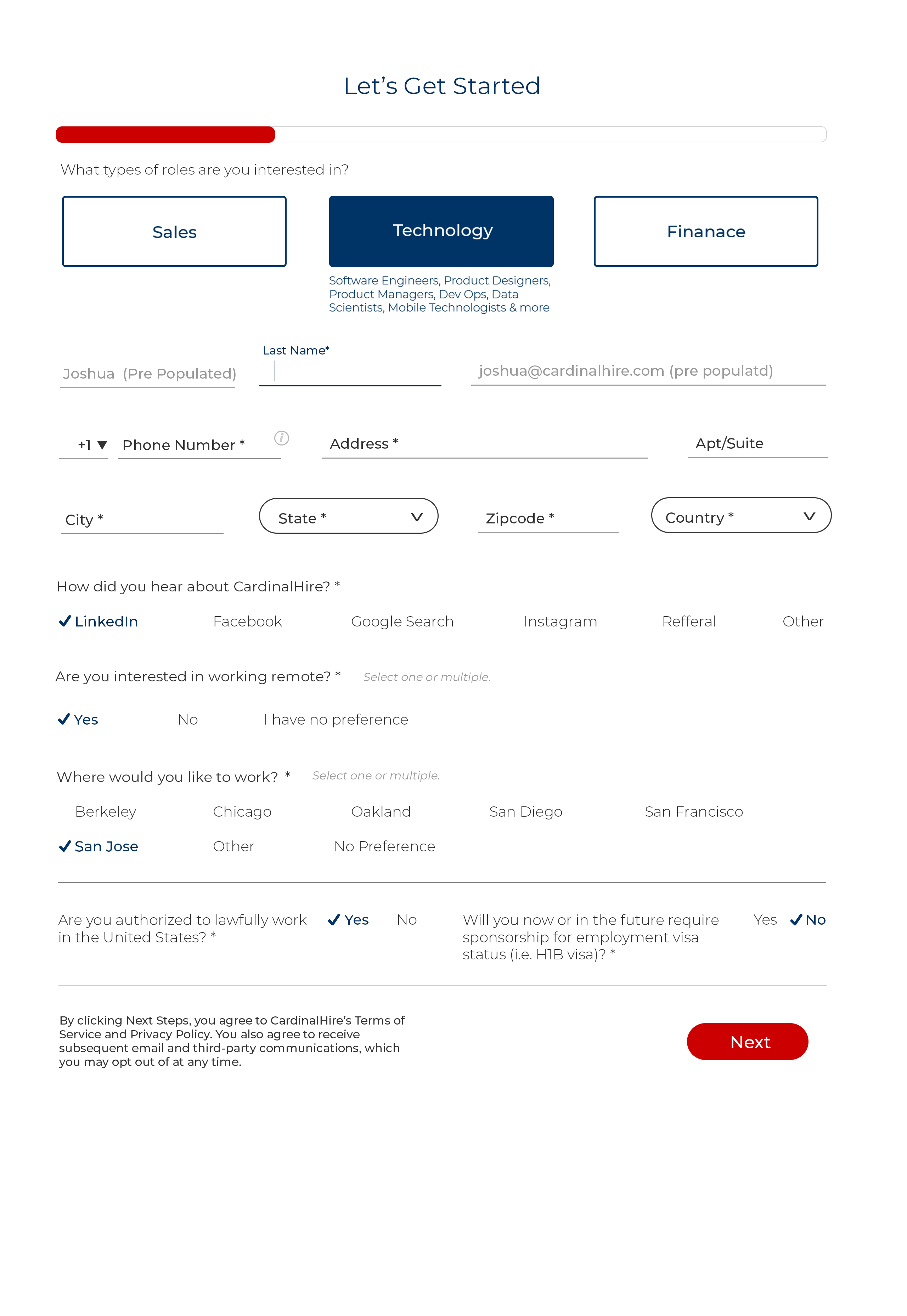
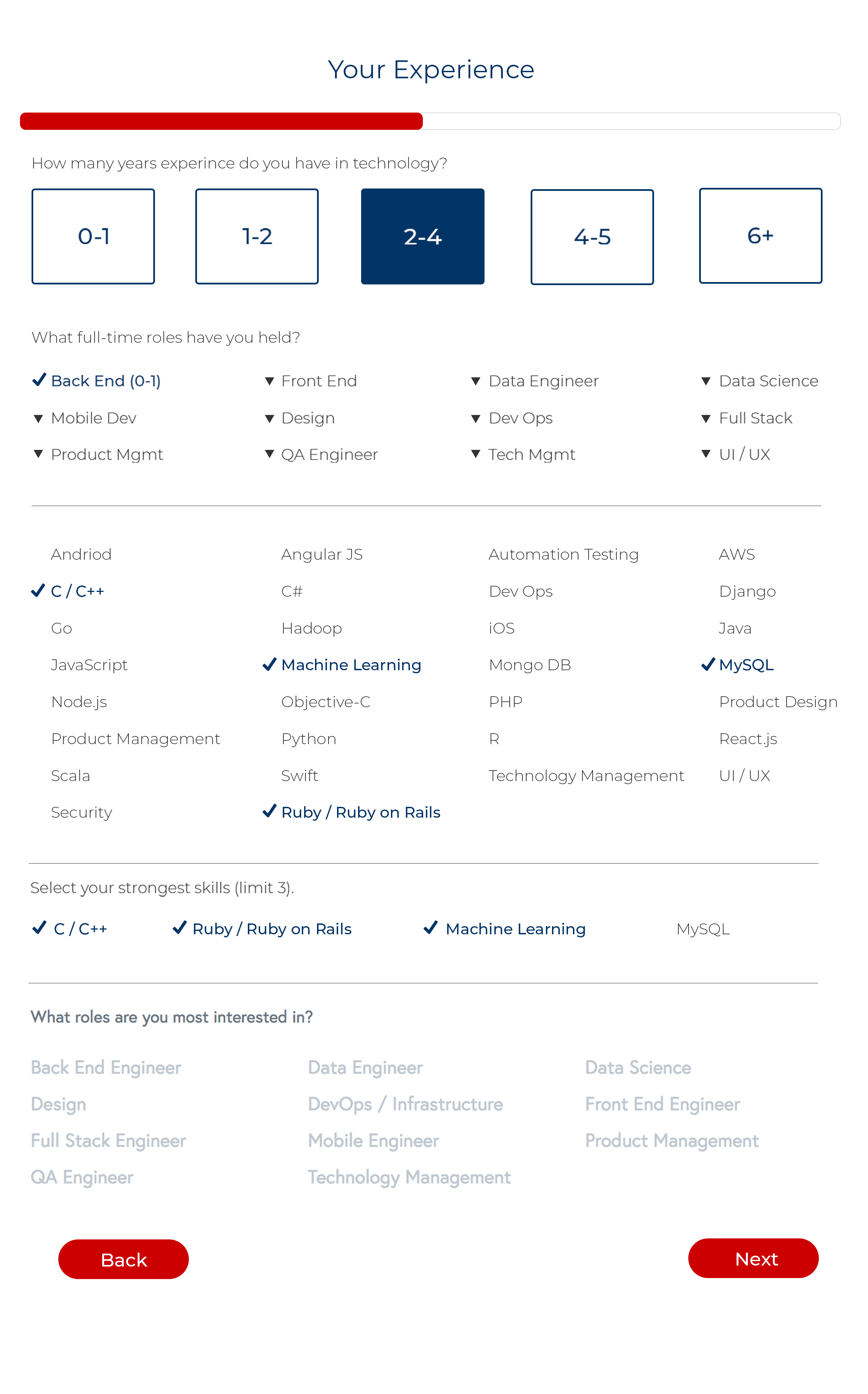
The engineering of the registration process was one of the more challenging tasks in introducing the CardinalHire platform. The questions posed to the user were engineered in such as way that we ask each user essentially the same questions in different manners, relative to their user-role, collecting the same information for each user, the most essential information in successfully setting up the user’s profile in four steps, lasting no more than five minutes at most to complete the registration.
Dashboard
[/ultimate_heading]
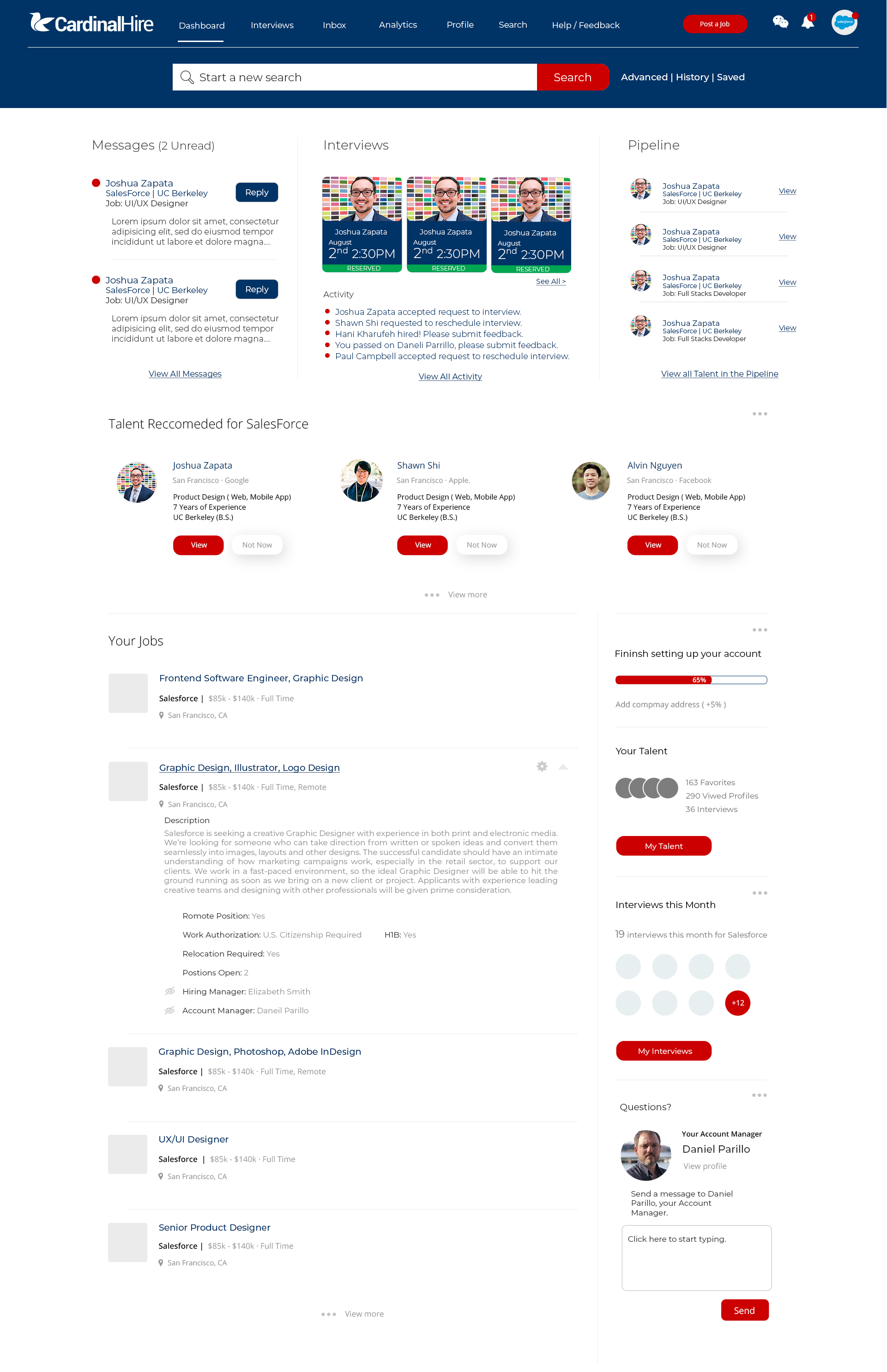
This is an example of an earlier version of what a fully populated dashboard looks like on CardinalHire. This image has all the bells and whistles, a snapshot of a fully active employer user-roles. The other user-roles follow the same, yet re-configured approach.
Messaging & Bulk Messaging
[/ultimate_heading]
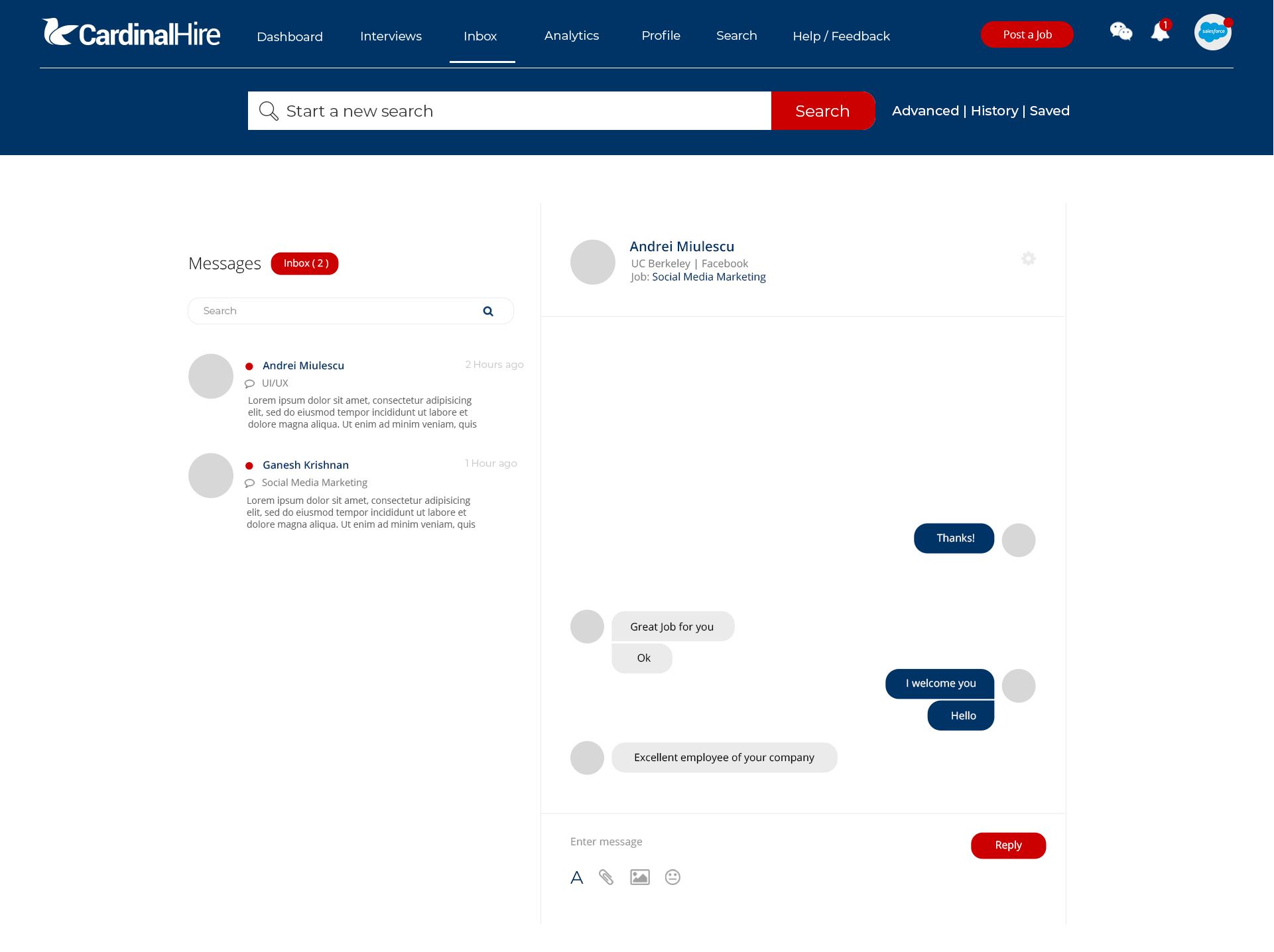
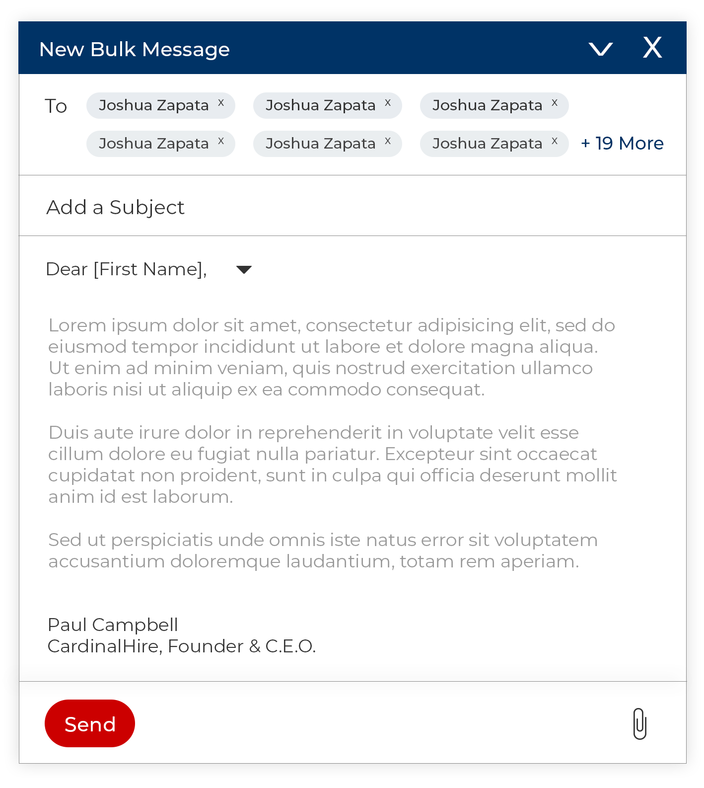
The messaging platform on CardinalHire is made to be simple and minimalistic, while also incorporating the use of bulk messaging which appears on the bottom screen when the action is summoned by the user.
Calendar & Settings
[/ultimate_heading]
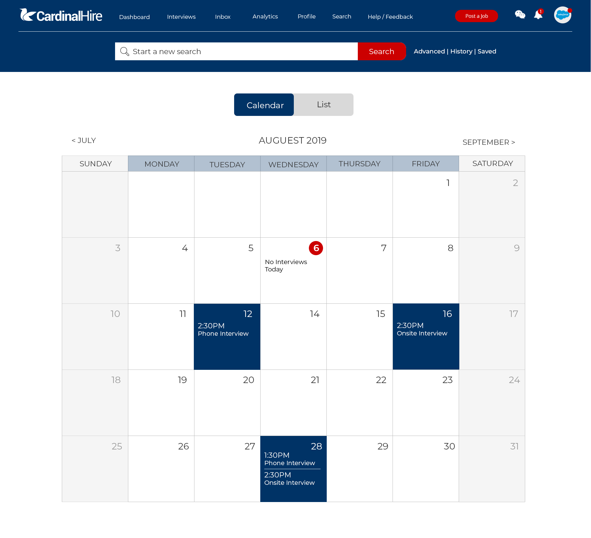
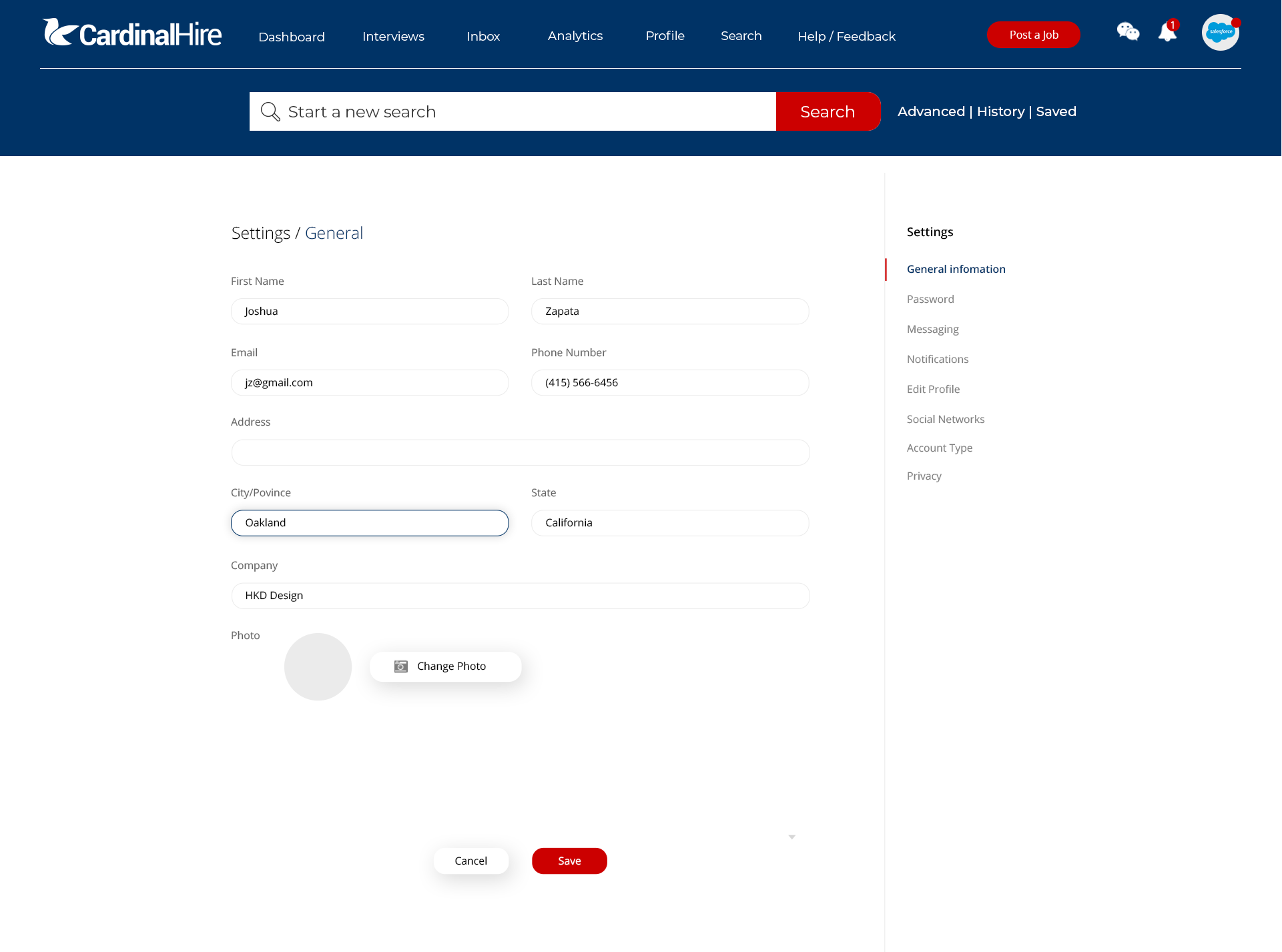
Additional aspects of the platform, include a calendar appointment system, analytics, settings, and help/feedback.
 Next Project
ABOUT THIS PROJECT
For the duration of my employment at CardinalHire, I primarily worked on UX Research and UI/UX Design. I found myself putting some of my skills to work to help with other aspects of the company such as marketing and branding, all shown here.
- Client:
- Categories:
- Skills:
- Share Project :
 Next Project
